
Framework
Global Presets UI Style Guide
01. Color palette
In this part of the style guide, you can modify each color inside the Text Module's background settings. Use that same color code inside the Text Module below it to have a written version of the color code too. Use these color codes inside your Divi Theme Builder default color palette afterward.
#FFFFFF
Primary #006880
Secondary #e1631f
Heading #006880
Body Text #414042
#000000
#FFFFFF
#b5b5b5
#b5b5b5
#414042
02. Text styles
In the second part of this style guide wireframe.
Sizing based upon viewport from 320px to 2560px with font size from 12px to 40px.
02 a. Text sizes
## Complete Typography Scale with All Presets and Use Cases Suggested sizes
--- ### ROW PRESETS
**Row - Standard Spacing:**
- Padding: clamp(1.5rem, 0.75rem + 2.34375vw, 2.75rem) (top/bottom)
- Gutter Width: 4 (default)
- Use Cases: General purpose rows, standard layouts, default spacing *
*Row - 2 Column Grid:**
- Grid: repeat(auto-fit, minmax(clamp(250px, 40vw, 500px), 1fr))
- Gap: clamp(1rem, 0.4rem + 1.875vw, 2rem)
- Use Cases: Two-column layouts, comparison tables, before/after, feature pairs
**Row - 3 Column Grid:**
- Grid: repeat(auto-fit, minmax(clamp(200px, 30vw, 350px), 1fr))
- Gap: clamp(1rem, 0.4rem + 1.875vw, 2rem)
- Use Cases: Service offerings, team members, feature highlights, testimonials
**Row - 4 Column Grid:**
- Grid: repeat(auto-fit, minmax(clamp(150px, 22vw, 280px), 1fr))
- Gap: clamp(0.75rem, 0.3rem + 1.40625vw, 1.5rem)
- Use Cases: Product catalogs, icon grids, logo collections, stats displays
**Row - 5 Column Grid (Ultrawide):**
- Grid: repeat(auto-fit, minmax(clamp(200px, 18vw, 320px), 1fr))
- Gap: clamp(1rem, 0.4rem + 1.875vw, 2rem)
- Use Cases: Large product catalogs, extensive portfolios, wide screen optimization
**Row - 6 Column Grid (Ultrawide):**
- Grid: repeat(auto-fit, minmax(clamp(150px, 15vw, 280px), 1fr))
- Gap: clamp(0.75rem, 0.3rem + 1.40625vw, 1.5rem)
- Use Cases: Dense icon grids, brand logo walls, social proof badges, partner logos
**Row - Asymmetric (Content + Sidebar):**
- Grid: minmax(600px, 1200px) minmax(300px, 500px)
- Gap: clamp(2rem, 1rem + 3.125vw, 4rem)
- Use Cases: Blog layouts with sidebar, product page with specs, content + navigation
**Row - Feature Grid (Ultrawide):**
- Grid: repeat(auto-fit, minmax(clamp(320px, 28vw, 450px), 1fr))
- Gap: clamp(1.5rem, 0.6rem + 2.8125vw, 3.5rem)
- Use Cases: Large feature cards, course catalogs, real estate listings
--- ### BUTTON PRESETS **Button - Primary:**
- Font Size: clamp(0.875rem, 0.775rem + 0.3125vw, 1rem)
- Padding: clamp(0.75rem, 0.55rem + 0.625vw, 1.125rem) | clamp(1.5rem, 0.9rem + 1.875vw, 2.5rem)
- Border Radius: clamp(0.25rem, 0.1rem + 0.46875vw, 0.5rem)
- Font Weight: 600
- Use Cases: Main CTAs, form submissions, primary actions, purchase buttons
**Button - Secondary:**
- Font Size: clamp(0.875rem, 0.775rem + 0.3125vw, 1rem)
- Padding: clamp(0.75rem, 0.55rem + 0.625vw, 1.125rem) | clamp(1.5rem, 0.9rem + 1.875vw, 2.5rem)
- Border Radius: clamp(0.25rem, 0.1rem + 0.46875vw, 0.5rem)
- Border Width: 2px - Background: Transparent
- Font Weight: 600
- Use Cases: Secondary actions, "Learn More" links, alternative options, ghost buttons
--- ### MODULE PRESETS **Blurb - Card Style:**
- Padding: clamp(1.5rem, 0.9rem + 1.875vw, 2.5rem) (all sides)
- Bottom Margin: clamp(1.5rem, 0.75rem + 2.34375vw, 2.75rem)
- Border Radius: clamp(0.5rem, 0.2rem + 0.9375vw, 1rem)
- Header Font Size: clamp(1.25rem, 0.95rem + 0.9375vw, 1.625rem)
- Body Font Size: clamp(1rem, 0.9rem + 0.3125vw, 1.125rem)
- Use Cases: Feature cards, service offerings, icon + text blocks, benefit highlights
**Blurb - Icon Top:**
- Icon Width: clamp(2rem, 1.2rem + 2.5vw, 3.5rem)
- Padding: clamp(1.5rem, 0.9rem + 1.875vw, 2.5rem) (all sides)
- Bottom Margin: clamp(1.5rem, 0.75rem + 2.34375vw, 2.75rem)
- Header Font Size: clamp(1.25rem, 0.95rem + 0.9375vw, 1.625rem)
- Use Cases: Process steps, features with icons, service descriptions, benefits
**CTA Module - Hero:**
- Padding: clamp(2rem, 1rem + 3.125vw, 3.5rem) (all sides)
-Border Radius: clamp(0.5rem, 0.2rem + 0.9375vw, 1rem)
- Header Font Size: clamp(1.75rem, 1.15rem + 1.875vw, 2.25rem)
- Header Line Height: clamp(2.1rem, 1.38rem + 2.25vw, 2.7rem)
- Body Font Size: clamp(1.125rem, 0.975rem + 0.46875vw, 1.313rem)
- Use Cases: Hero CTAs, promo boxes, announcement banners, featured callouts
**Testimonial - Card:**
- Padding: clamp(1.5rem, 0.9rem + 1.875vw, 2.5rem) (all sides)
- Bottom Margin: clamp(1.5rem, 0.75rem + 2.34375vw, 2.75rem)
- Border Radius: clamp(0.5rem, 0.2rem + 0.9375vw, 1rem)
- Body Font Size: clamp(1rem, 0.9rem + 0.3125vw, 1.125rem)
- Use Cases: Customer reviews, client testimonials, social proof, quotes
**Pricing Table - Featured:**
- Padding: clamp(1.5rem, 0.9rem + 1.875vw, 2.5rem) (all sides)
- Border Radius: clamp(0.5rem, 0.2rem + 0.9375vw, 1rem)
- Header Font Size: clamp(1.5rem, 1.1rem + 1.25vw, 2rem)
- Body Font Size: clamp(1rem, 0.9rem + 0.3125vw, 1.125rem)
- Use Cases: Pricing tables, subscription plans, product tiers, package comparisons
**Image - Rounded:**
- Bottom Margin: clamp(1rem, 0.4rem + 1.875vw, 2rem)
- Border Radius: clamp(0.25rem, 0.1rem + 0.46875vw, 0.5rem)
- Max Width: 100%
- Use Cases: General images, photos, graphics with subtle rounded corners
**Image - Circle:**
- Bottom Margin: clamp(1rem, 0.4rem + 1.875vw, 2rem)
- Border Radius: 50%
- Use Cases: Profile photos, team member headshots, avatars, author images
**Gallery Grid - Ultrawide:**
- Grid: repeat(auto-fill, minmax(clamp(200px, 15vw, 350px), 1fr))
- Gap: clamp(1rem, 0.4rem + 1.875vw, 2rem)
- Grid Auto Flow: dense
- Use Cases: Photo galleries, portfolio images, product catalogs, image showcases
**Blog Grid
- Masonry (Ultrawide):**
- Grid: repeat(auto-fill, minmax(clamp(300px, 25vw, 450px), 1fr))
- Gap: clamp(1.5rem, 0.6rem + 2.8125vw, 3rem)
- Grid Auto Flow: dense
- Use Cases: Blog post grids, news sections, article listings, content archives
--- ### SPACING PRESETS
**Divider - Spacer Small:**
- Height: clamp(0.5rem, 0.2rem + 0.9375vw, 1rem)
- Divider Hidden: Yes
- Use Cases: Subtle spacing between elements, compact layouts, tight sections
**Divider - Spacer Medium:**
- Height: clamp(1rem, 0.4rem + 1.875vw, 2rem)
- Divider Hidden: Yes
- Use Cases: Standard vertical rhythm, general spacing, section breathing room
**Divider - Spacer Large:**
- Height: clamp(2rem, 0.8rem + 3.75vw, 4rem)
- Divider Hidden: Yes
- Use Cases: Major section breaks, dramatic spacing, hero section gaps
--- ### SPECIALIZED PRESETS
**Text - Constrained Width (Readability):**
- Font Size: clamp(1rem, 0.9rem + 0.3125vw, 1.125rem)
- Line Height: clamp(1.6rem, 1.44rem + 0.5vw, 1.8rem)
- Max Width: 75ch (optimal reading length)
- Alignment: Center - Side Padding: clamp(1rem, 0.4rem + 1.875vw, 2rem)
- Use Cases: Long-form articles, blog posts, optimal reading experience on ultrawide displays
**Column - Sidebar Sticky (Ultrawide):**
- Position: sticky
- Top: clamp(2rem, 1rem + 3.125vw, 4rem)
- Height: fit-content
- Use Cases: Table of contents, persistent navigation, related content sidebar, ad placements
Font
Montserrat
Heading clamp() functions
Primary
Secondary
Tertiary
Heading 1 using clamp(1.875rem, calc(2.33rem + 8.13vw), 3.125rem)
Line height: clamp(2.25rem, calc(2.8rem + 8vw), 3.75rem)
Heading 2 using clamp(1.5rem, calc(1.9rem + 6.5vw), 2.5rem)
line height: clamp(1.875rem, calc(2.3rem + 6.5vw), 3.125rem)
Heading 3 using clamp(1.25rem, calc(1.6rem + 5vw), 2rem)
line height: clamp(1.625rem, calc(2rem + 5vw), 2.6rem)
Heading 4 using clamp(1.125rem, calc(1.4rem + 4vw), 1.75rem)
Line height: clamp(1.45rem, calc(1.8rem + 4vw), 2.3rem)
Heading 5 using clamp(1rem, calc(1.2rem + 3vw), 1.5rem)
line height: clamp(1.35rem, calc(1.5rem + 3vw), 2.05rem)
Heading 6 using clamp(0.875rem, calc(1rem + 2vw), 1.25rem)
Line height: clamp(1.225rem, calc(1.3rem + 2vw), 1.75rem)
Body Text
Small Body Text:
Traffic Management Solutions enhances city travel with smart traffic signals and AI data, simplifying commutes. The rise of electric and self-driving cars, along with better roads, fosters safer, more accessible streets for healthier, sustainable urban environments.
Regular Body Text:
Traffic Management Solutions enhances city travel with smart traffic signals and AI data, simplifying commutes. The rise of electric and self-driving cars, along with better roads, fosters safer, more accessible streets for healthier, sustainable urban environments.
Large Body Text:
Traffic Management Solutions enhances city travel with smart traffic signals and AI data, simplifying commutes. The rise of electric and self-driving cars, along with better roads, fosters safer, more accessible streets for healthier, sustainable urban environments.
List
- Small Body Text
- Small Body Text
- Small Body Text
- Regular Body Text
- Regular Body Text
- Regular Body Text
- Large Body Text
- Large Body Text
- Large Body Text
All in one
Heading 1
Heading 2
Heading 3
Heading 4
Heading 5
Heading 6
Lorum ipsum dolor sit amet.
- Lorum Ipsum
Heading 1
Heading 2
Heading 3
Heading 4
Heading 5
Heading 6
Lorum ipsum dolor sit amet.
- Lorum Ipsum
Heading 1
Heading 2
Heading 3
Heading 4
Heading 5
Heading 6
Lorum ipsum dolor sit amet.
- Lorum Ipsum
Montserrat
03. Modules
The last part of this style guide handles some of the most-used modules inside Divi. Here, we're also providing you with a primary, secondary and tertiary version of each module which you can style and add as a global preset. Feel free to create more alternative designs for each module.
Module
Primary
Secondary
Tertiary
Button
Blurb

Your Title Goes Here
Your content goes here. Edit or remove this text inline or in the module Content settings. You can also style every aspect of this content in the module Design settings and even apply custom CSS to this text in the module Advanced settings.
Your Title Goes Here
Your content goes here. Edit or remove this text inline or in the module Content settings. You can also style every aspect of this content in the module Design settings and even apply custom CSS to this text in the module Advanced settings.
Your Title Goes Here
Your content goes here. Edit or remove this text inline or in the module Content settings. You can also style every aspect of this content in the module Design settings and even apply custom CSS to this text in the module Advanced settings.
Email optin
top/bottom padding: clamp(0.5rem, 1vh, 4rem)
left/right padding: clamp(0.5rem, 1vw, 4rem)
Contact form
Image Sizes
Small
Avatars, icons, product thumbnails, small column layouts.
clamp(50px, 10vw, 150px)
Medium
Blog post featured images, product displays in a grid, general content images.
clamp(250px, 40vw, 600px)
Large
Hero section images, full-width content images, single-column displays.
clamp(350px, 80vw, 1200px)
Image
Small
Medium
Large
Call to action
Divider
Person

Person Name
Position
Your content goes here. Edit or remove this text inline or in the module Content settings. You can also style every aspect of this content in the module Design settings and even apply custom CSS to this text in the module Advanced settings.
Person Name
Position
Your content goes here. Edit or remove this text inline or in the module Content settings. You can also style every aspect of this content in the module Design settings and even apply custom CSS to this text in the module Advanced settings.
Person Name
Position
Your content goes here. Edit or remove this text inline or in the module Content settings. You can also style every aspect of this content in the module Design settings and even apply custom CSS to this text in the module Advanced settings.
Social Media Follow
Toggle
Title Here
Your content goes here. Edit or remove this text inline or in the module Content settings. You can also style every aspect of this content in the module Design settings and even apply custom CSS to this text in the module Advanced settings.
Title Here
Your content goes here. Edit or remove this text inline or in the module Content settings. You can also style every aspect of this content in the module Design settings and even apply custom CSS to this text in the module Advanced settings.
Title Here
Your content goes here. Edit or remove this text inline or in the module Content settings. You can also style every aspect of this content in the module Design settings and even apply custom CSS to this text in the module Advanced settings.
Testimonial
Your content goes here. Edit or remove this text inline or in the module Content settings. You can also style every aspect of this content in the module Design settings and even apply custom CSS to this text in the module Advanced settings.
Your content goes here. Edit or remove this text inline or in the module Content settings. You can also style every aspect of this content in the module Design settings and even apply custom CSS to this text in the module Advanced settings.
Your content goes here. Edit or remove this text inline or in the module Content settings. You can also style every aspect of this content in the module Design settings and even apply custom CSS to this text in the module Advanced settings.
Video
Accordion
Your Title Goes Here
Your content goes here. Edit or remove this text inline or in the module Content settings. You can also style every aspect of this content in the module Design settings and even apply custom CSS to this text in the module Advanced settings.
Your Title Goes Here
Your content goes here. Edit or remove this text inline or in the module Content settings. You can also style every aspect of this content in the module Design settings and even apply custom CSS to this text in the module Advanced settings.
Your Title Goes Here
Your content goes here. Edit or remove this text inline or in the module Content settings. You can also style every aspect of this content in the module Design settings and even apply custom CSS to this text in the module Advanced settings.
Your Title Goes Here
Your content goes here. Edit or remove this text inline or in the module Content settings. You can also style every aspect of this content in the module Design settings and even apply custom CSS to this text in the module Advanced settings.
Your Title Goes Here
Your content goes here. Edit or remove this text inline or in the module Content settings. You can also style every aspect of this content in the module Design settings and even apply custom CSS to this text in the module Advanced settings.
Your Title Goes Here
Your content goes here. Edit or remove this text inline or in the module Content settings. You can also style every aspect of this content in the module Design settings and even apply custom CSS to this text in the module Advanced settings.
Blog

Open Positions at Levy Company
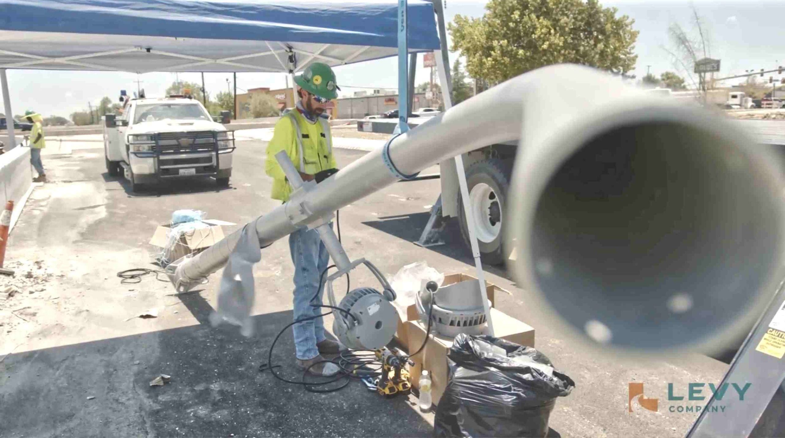
Safety & Quality in Highway Sign Installation
Safety & Quality in Highway Sign Installation

San Antonio Traffic Signal Modernization
Leveraging ITS to Enhance Traffic Flow in San Antonio

Merging With TMS
What It Means for Our Customers (January 2025 expansion)
Open Positions at Levy Company
Safety & Quality in Highway Sign Installation
Safety & Quality in Highway Sign Installation
San Antonio Traffic Signal Modernization
Leveraging ITS to Enhance Traffic Flow in San Antonio
Merging With TMS
What It Means for Our Customers (January 2025 expansion)
Open Positions at Levy Company
Safety & Quality in Highway Sign Installation
Safety & Quality in Highway Sign Installation
San Antonio Traffic Signal Modernization
Leveraging ITS to Enhance Traffic Flow in San Antonio
Merging With TMS
What It Means for Our Customers (January 2025 expansion)